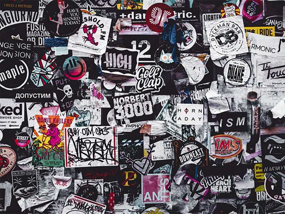
You must have heard how eyes are the window to one’s soul. Well, brand logos kind of do the same for organizations. Logos being one of the first few things a person looks at when checking out your business holds a very crucial place in terms of importance. It acts as the face of the company since that is what goes up everywhere, be it the top of every formal correspondence (letterhead) or the top of your place of business; rendering it essential for the entrepreneurs to be very particular with what their logo should look like. These constitute an essential aspect of the company’s branding.
This is exactly why businesses need to hire logo designers who are pros in their craft. These professionals incorporate the newest trends in the ongoing market, alongside the kind of statement the company is trying to make and customizations by the client themself to make the perfect logo well-suited to your style of business.
Logos today have evolved to more minimalist designs as opposed to complex ones formerly. The font, color, complexity is all based on your representation of the business. For instance, a classier-looking, neutral-colored logo is best suited for a luxury brand, while a chunky, colorful logo for a children’s brand.
Even though the events of last year have untethered a lot of unrest, the kind never experienced before, the logo game is still going strong, resulting in the dire need to rebrand after being chained indoors for the longest time. Here are a few logo trends for the year 2021:
Minimalist approach
Minimalism works like no less than sorcery to be exact, you never know what you can achieve with the simplest of designs that are appropriate and communicate effectively because days for complicated logos are far beyond gone.
Wordmark logos
Wordmark logos have been there since forever. And there is no denying the fact that these kinds of logos are remarkably recognizable and great with building brand identity. Logo designers are always pushing boundaries to be as creative with fonts and colors as possible to make these logos as peculiar as possible. It ensures that the entire focus of the logo is concentrated on the brand name.
Disappearing letters
Disappearing letters is an interesting way to further customize a wordmark logo, by fading or making the parts of alphabets go missing. However, one should not go overboard with it, therefore it is imminent to ensure that there is a perfect balance between the visible and missing alphabets hindering the legibility of the logo.
Black and white
Black and white being the divine combination has never been out of fashion in the first place. It maintains the minimalism and sophistication of the logos by not creating a hot mess of colors hence appears very neat and appealing to the eyes as well. These logos are very elegant and classy looking.
Vivid colors
Even though black and white logos are the classy route, it is not the way to go for every brand. Many brands like their logos standing out with all those bright, neon, and funky colors. And the fun part is there is an entire science involved in the selection of colors. For instance:
- Red symbolizes passion, excitement, and anger. Brands that want to send out a message of playful, youthful, bold use this color. It also is thought to increase appetite hence used by restaurants.
- Brown logos are used to give off a rugged, serious, and masculine vibe. And is often used by brands looking to give a vintage handmade feel.
- Yellow logos give off sunshine-y, cheery friendly vibes. Brands that are more accessible use this as opposed to mature or luxury brands.
Therefore, it can easily be said that colors when chosen wisely can be used to your own advantage can enhance a viewer’s desire for association.
Gradient
This is the trend that has returned and is here to stay. It blends the colors so that each shade transitions into the next – creating an overall cohesive effect. It helps enhance and give dimension to a flat logo and gives it a solid visual impact. It also makes logos immediately recognizable, especially when color combinations are made wisely and to your own benefit.
Character and mascot
With the rise in technology and innovation, logo designers have found the perfect use for it in their craft as well. Creating personalized brand characters and mascots for the brand has become a new and fun way to create an identity and engage with the viewers. These kinds of logos really give the brand a face; whether it is that of the founder himself like Colonel Sanders for KFC or Tony the tiger for Kellog’s frosted flakes. These mascots help the viewer establish an emotional connection with the brand
Simple geometry shapes
This kind of logos have been around for a while now. However, these never get old as there is always plenty of room for innovation. It is mind-boggling what a designer can do with simple geometric shapes put together and give them meaning. With that being said, it is easy to say it would take a genius to pull this off. Such logos cleverly designed with proper color schemes make it impossible for viewers to bat an eye.
It is very interesting to see that alongside changes in logo design trends, the mode of work of logo designers has diversified as well. Since “people staying indoors” had become the new normal, it gave a solid push to the developing industry of freelancing, resulting in people benefiting from Logo design services online. This has become a very convenient and popular tool for the people as they can now find various logo designers, with varying ranges in terms of fee and expertise, coming from different geographical locations on ONE platform, with price ranges like nowhere else. This platform has truly won the world over because in case you are not aware; Freelance is the future.


