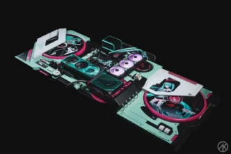
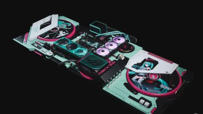
Interfaces on PC move fast. Control panels, overclocking tools, RGB suites, launchers, updaters. If icons wobble, users miss states and click the wrong thing. A clean system keeps dashboards readable and installers sane.
Standardize before you ship
Pick one family and keep it everywhere: app chrome, settings panes, trays, on‑screen overlays, and web help. Lock base sizes at 16, 20, and 24 for controls. Reserve 32 for overlays and 40–64 for empty states, safety dialogs, and intro cards. Align to an 8‑point rhythm so toolbars and property grids snap. Stroke and corner rules must match from fan curve to profile save to power plan.
Match the platform language
Windows 11 softened geometry and rounded corners. Icons that follow the same visual grammar feel native in WinUI, WPF, Electron, and browser UIs. Outline for idle, filled for selected is a simple rule that survives light and dark themes. Keep silhouettes bold. Hairline detail dies first on high‑DPI and scaled desktops.
Semantics users recognise at 2 a.m.
Map one concept to one metaphor and stop there. Fan, temperature, voltage, curve, update, driver, profile, macro, overlay, capture. If two icons try to mean Download, one of them is wrong. Pair icons with short labels where a mistake costs time or stability: flashing firmware, applying XMP, deleting a profile.
Performance for desktop and web shells
SVG is ideal for in‑app UIs and web help: it inherits color and respects themes. PNG and ICO still matter for installers, taskbar, file associations, and favicons. Keep viewBox intact so scaling stays clean. Preload the handful of marks visible above the fold in dashboards. On Electron, cache small SVG fragments in memory; on native stacks, use vector geometries where available rather than shipping a sprite sheet.
File management and Explorer parity
Users expect folder metaphors that match the OS. For file pickers, backup tools, and library managers, do not improvise. Mid‑article reference when you need a familiar baseline: windows 11 folder icons. Mirror the geometry when drawing file‑type variants so your app’s libraries and the shell read as one system.
Accessibility that survives real desktops
High Contrast, color filters, HDR wallpapers, and transparency effects can bury weak outlines. Use filled variants or place icons on a subtle container. Targets around 24 with honest padding help mouse, touch, and stylus. Decorative marks get aria-hidden; meaningful controls get accessible names through UIA or ARIA. Test with keyboard focus on dark acrylic backgrounds and busy game overlays, not just on a clean canvas.
Color and modes
Let icons inherit text color and adopt accent tokens for emphasis. Reserve status hues for success, warning, error, recording, and elevated permission states. Do not brand every control; keep brand color for headers, calls to action, and marketing surfaces. When backgrounds get noisy, a soft container with two points of internal padding stabilizes the hit area.
Review lab notes for PC software
Dashboards: 20–24 for navbar and tools, 16 in dense tables, 40–64 for empty states and sensors with no data. Overlays: 24 on 1080p, 28–32 on 1440p and 4K while preserving the same optical weight. Installers: clear state icons for Ready, Downloading, Installing, Failed, Restart required. Updaters: reuse the same metaphors in the app and in toast notifications so meaning does not flip.
QA checklist that actually catches issues
One family per surface. Sizes tied to an 8‑pt grid. Outline for idle, filled for selected. Contrast verified on light, dark, HDR, and transparency‑heavy backgrounds. Focus rings visible in both native and web views. No duplicate metaphors. File icons match shell expectations. SVGs keep viewBox. ICOs are sharp at 16, 20, 24, 32.
Governance for small teams
Write a one‑page spec. Family, sizes, tokens, containers, exceptions. Build a tiny wrapper component in your stack that sets size, viewBox, and currentColor automatically. Batch export on release day with clear names. save. load. update. fan. macro. You keep the system quiet while features move.
Do this and your utilities read at a glance, gamers find controls mid‑session, and reviewers spend time measuring performance instead of puzzling over icons.